UX design · Everly
Making a wedding planner easier to say yes to
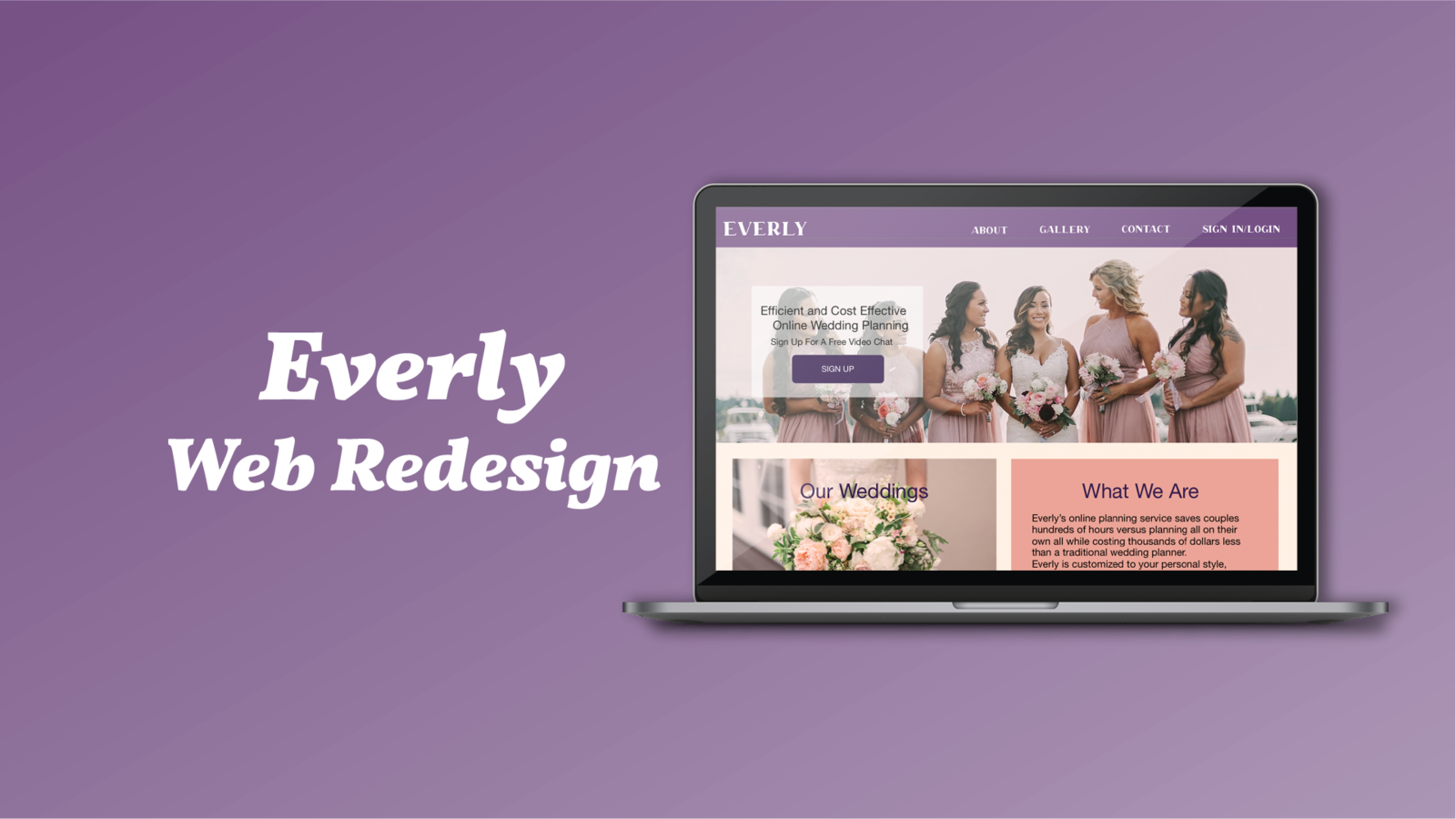
Research-led website redesign for an online wedding planning startup, built to increase sign-ups.
Duration
- 3 weeks
Role
- UX Researcher (team of 3)
Tools
- Adobe XD · Illustrator · Photoshop
My impact
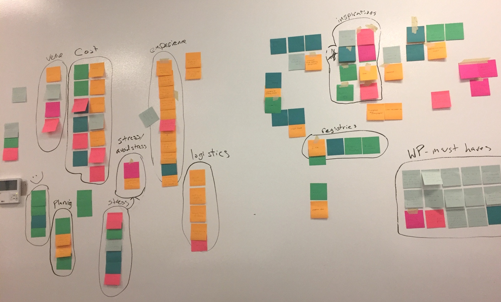
- ✦Ran a 28-person survey, interviews with 3 couples and 2 experts, then an affinity map to find what mattered.
- ✦Led usability tests with 5 people and turned results into 6 specific design fixes.
- ✦Rewrote the confusing 'how it works' steps — no tester could explain the original.
- ✦Taught teammates photo color-grading and client handling. The client was happy and kept working with the team.
The problem
Couples early in planning want to compare price, style and offerings quickly. Everly's visitors were confused about services, couldn't find past work, and left before trying the free offers.
The bet
Simplify the most-visited pages, make the free offers obvious, and connect the gallery to Pinterest. Success = more free intro call sign-ups and sample-pack downloads.
“Every marketing dollar you spend acquiring a customer has to be spent again the following year.”
— Kaitlyn Tiffany, Vox
Research
What testing changed
- Navigation
- 'Approach' confused people next to 'About', so it moved under About.
- Photos
- Taught the visual designer to color-filter photos to match the brand.
- Process copy
- Rewrote the steps from Everly's point of view and cut the number of steps.
- Icon
- Drew a gender-neutral 'Wedding Day' icon missing from the icon pack.
- Scroll cue
- Added an arrow when testers didn't realize the page scrolled.
What I learned
Research reminded me of theater prop work — hunting facts for accuracy. I learned Adobe XD on the fly and became the team's go-to for client experience and branding.