UX design · Katsu Burger
Clearing the clutter off a restaurant website
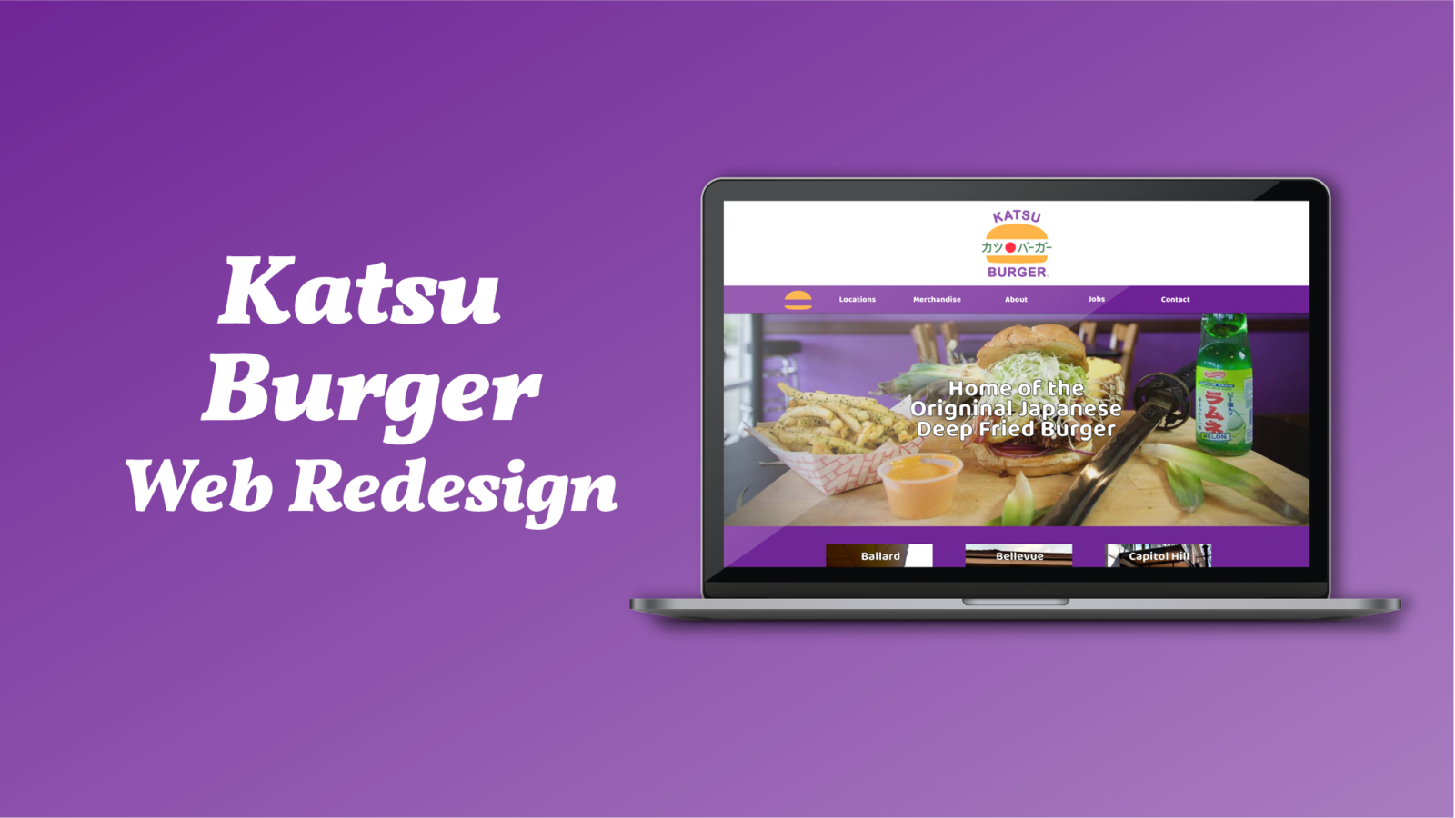
Solo redesign of a Seattle burger chain's site, from competitor research to tested prototype.
Duration
- 2 weeks
Role
- Project Manager · Interaction · Visual Designer
Tools
- Sketch · InVision · Photoshop · Illustrator
My impact
- ✦Did every step alone in 2 weeks: competitor analysis, persona, user flows, sitemaps, sketches, wireframes, prototype and testing.
- ✦All 3 test users finished all 3 tasks with ease.
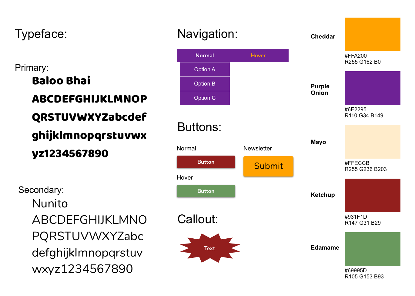
- ✦Built an accessible color system (AAA contrast) that kept the brand's playful flair.
The problem
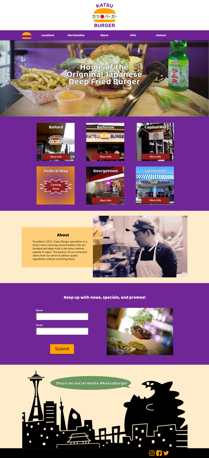
New customers hit too many photos and confusing navigation on the homepage, and left before trying Katsu Burger.
“Restaurant owners understand the importance of atmosphere in their physical location... The website is no different.”
— Brent Hartmann, Bitcookie
Process
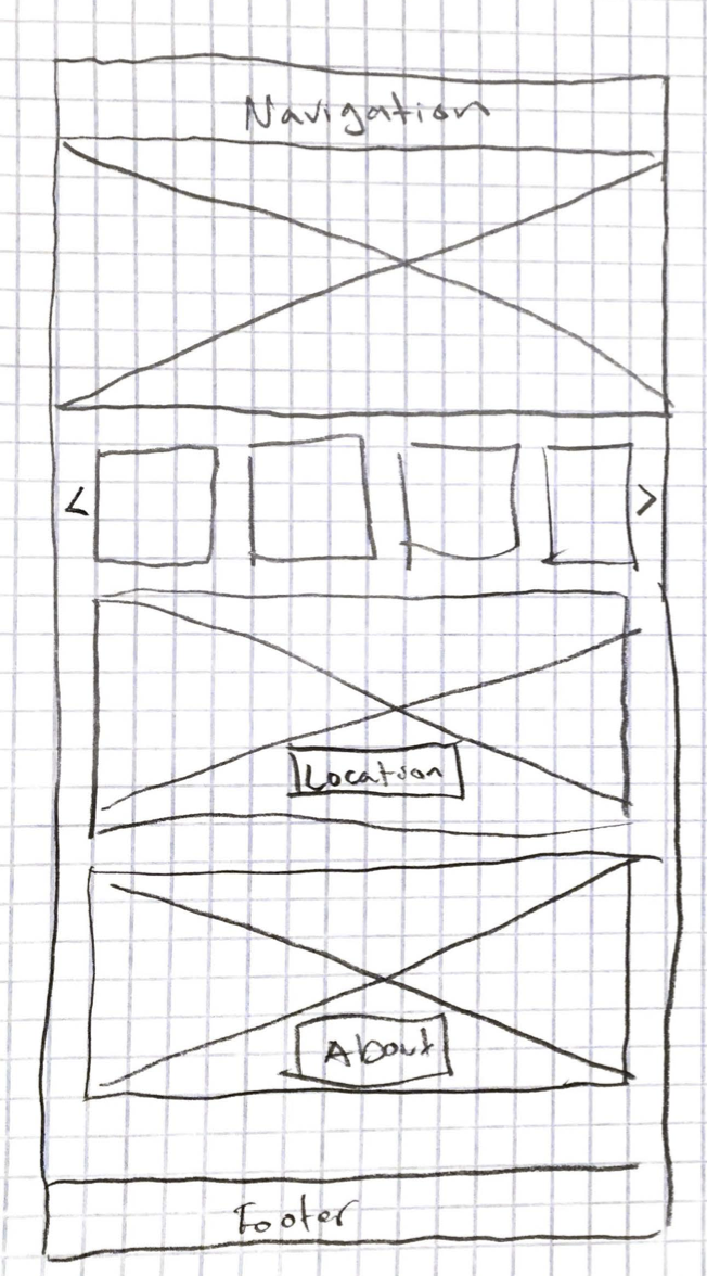
Compared 8 Oz. Burger and Mr Saigon, wrote 3 user scenarios as tiny stories, mapped a main site and a separate merch shop so cart and sign-in don't distract, sketched homepages, then wireframed and prototyped 4 key pages.
Key finding
Users wanted to reach their own location in as few steps as possible, so the 'all locations' page was skipped.
Final design
What I'd do next
Test different color schemes with users and build a persona from real research, since the provided one didn't match reviews and interviews.